Overview
Four fellow EDI students and I formed a team and joined the Design For America family to work on understanding the mental struggles of adolescents and young adults. We initiated by identifying these struggles of the users within their journey from incrementally building up their situations to understanding, accepting it as a mental illness, and to seeking professional help and improving.
Scope
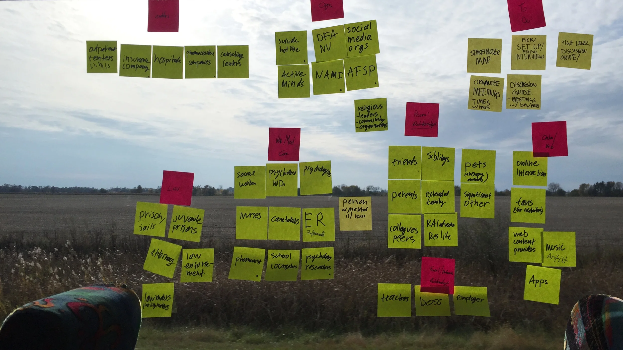
The team commenced the project by understanding mental health field and conducted secondary research on the topic prior to interviews with stakeholders. With secondary research, team members individually identified different stakeholders and fields within the mental health field. The members then shared the information to start choosing the focus area. The team spent 3 hours on a bus ride discussing each and every potential topic, and landed on: Mental health of teenagers and young adults, and the stuggles they may go through on the path of getting better.
Research
Once the overall area/topic was clear, the team focused on recruiting primary users. In order to not overwhelm these patrons, each team member conducted these interviews individually. With each phone and in person interview, the team learned various insights, but more importantly, emphasized with the patients' journey and struggles.
Provider POV
While conducting interviews with target users, the team reached out to professionals, not only to learn from their experiences and expertise, but also create future partnerships. The team understood that there are also unique struggles that the providers encounter such as the time management. Providers can only see a patient for a limited duration at a time, and within that time, not only they focus on fully understanding the struggles of the patient, but also try to help them and heal them.
Synthesis
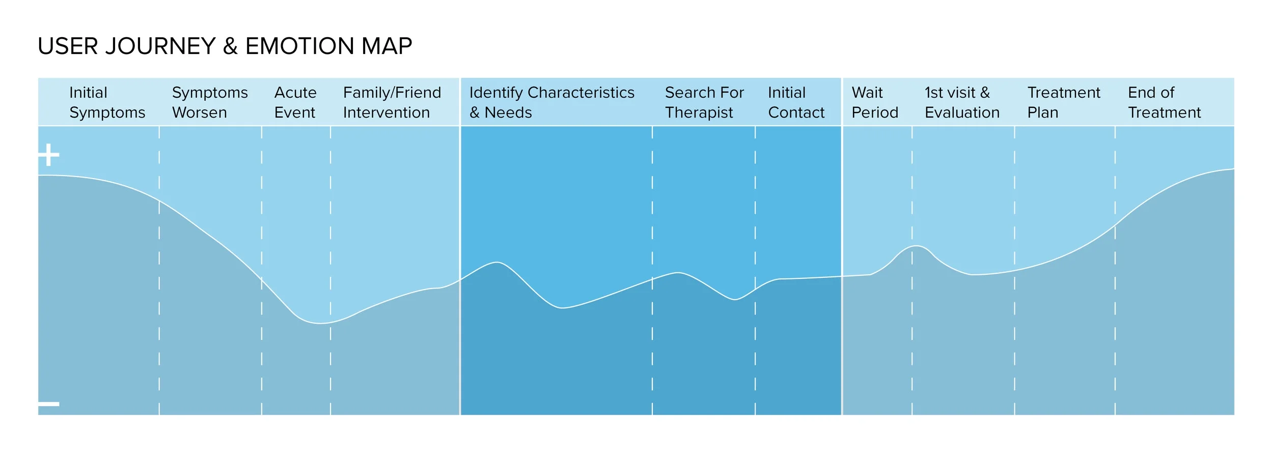
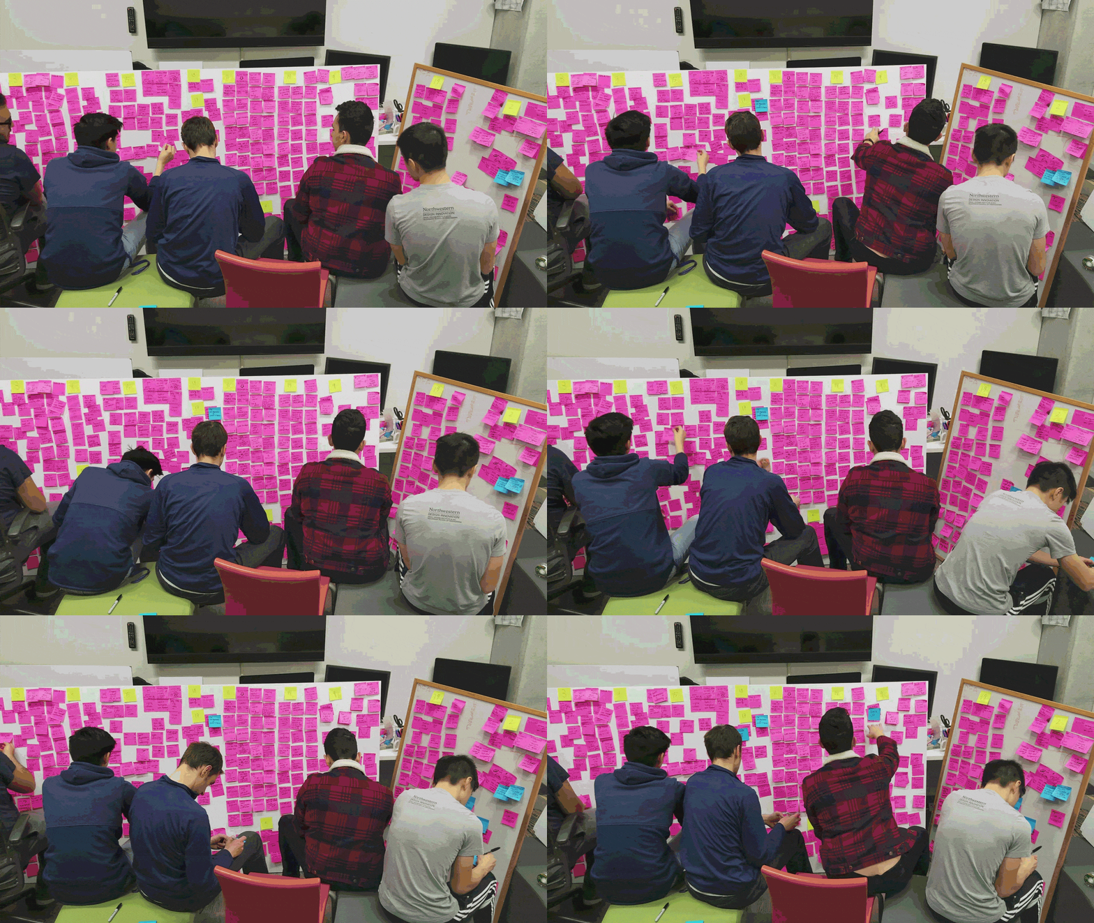
The team gathered information from the secondary research and insights from each and every interview with users and providers, to properly identify the tensions. The team created various frameworks including user journey map showcasing the touch points and the user's emotions through the process. After understanding the overall journey, the team decided to focus further on the middle section highlighted above: the time frame starting from accepting the problem until meeting with a professional. Within that journey/time frame, the team identified multiple tensions but in the end, chose a design direction at a late night: addressing the lack of proper patient-provider matching and the lack of patient support prior to the initial session.
Design Direction
How can we help people find a mental health professional that will match their needs and support them prior to the initial treatment?






Prototype
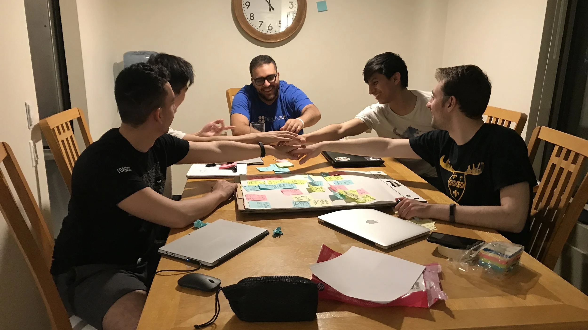
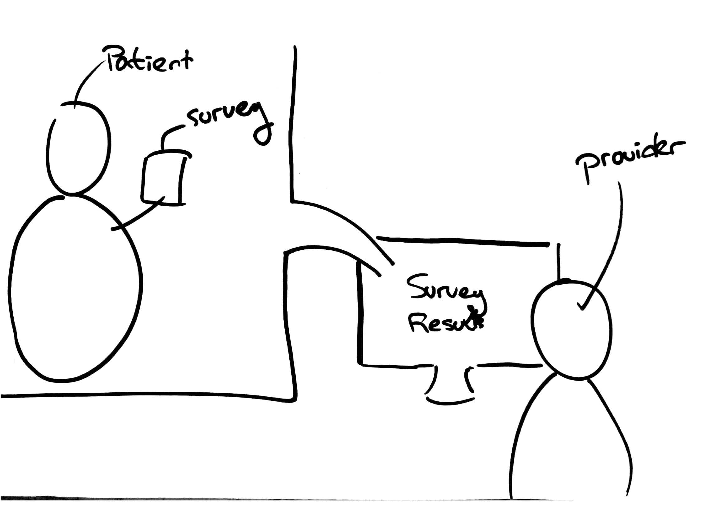
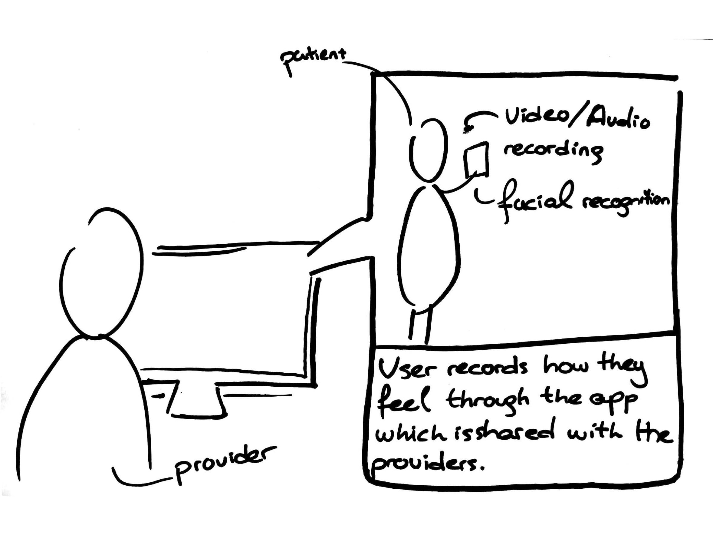
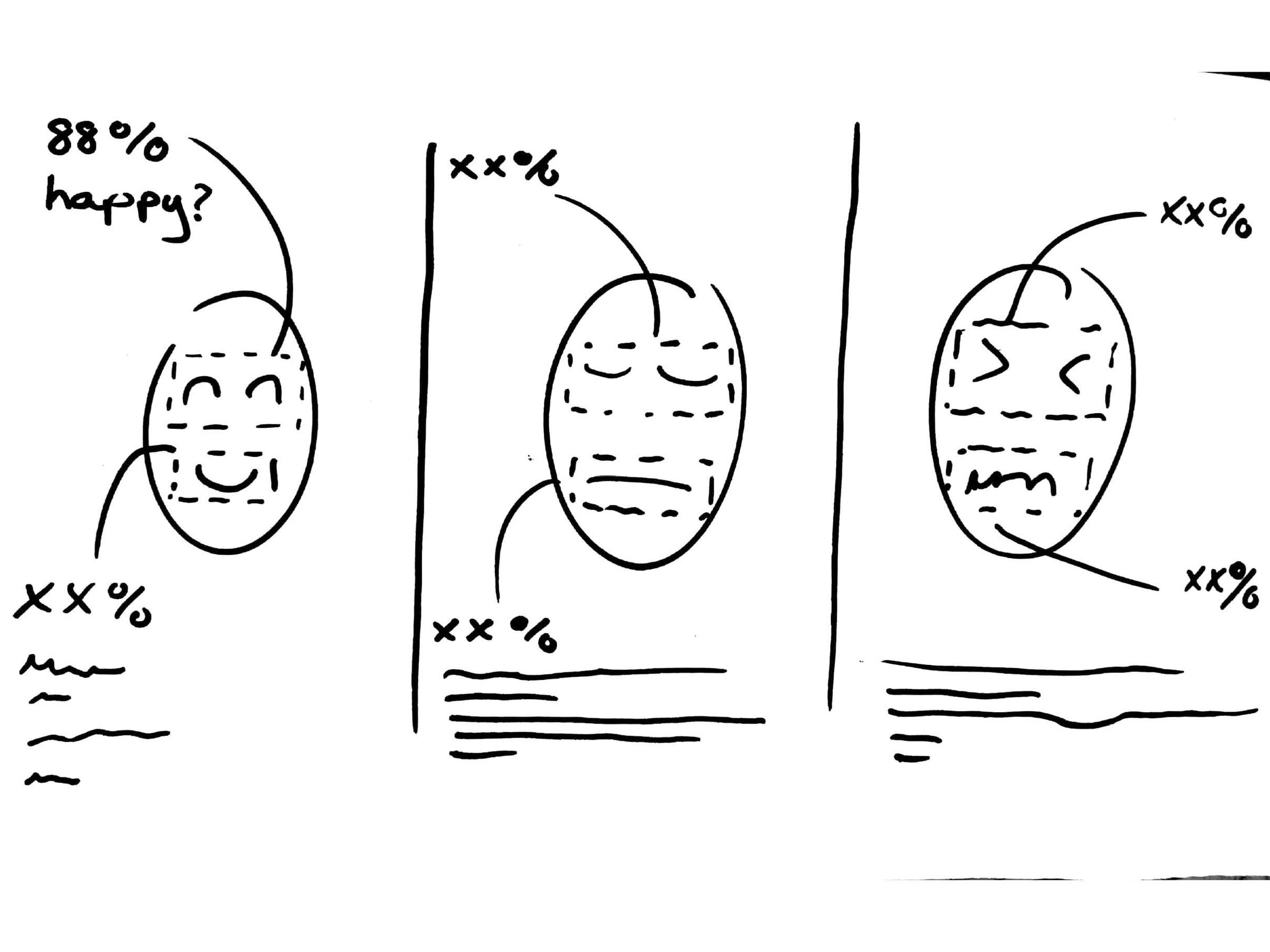
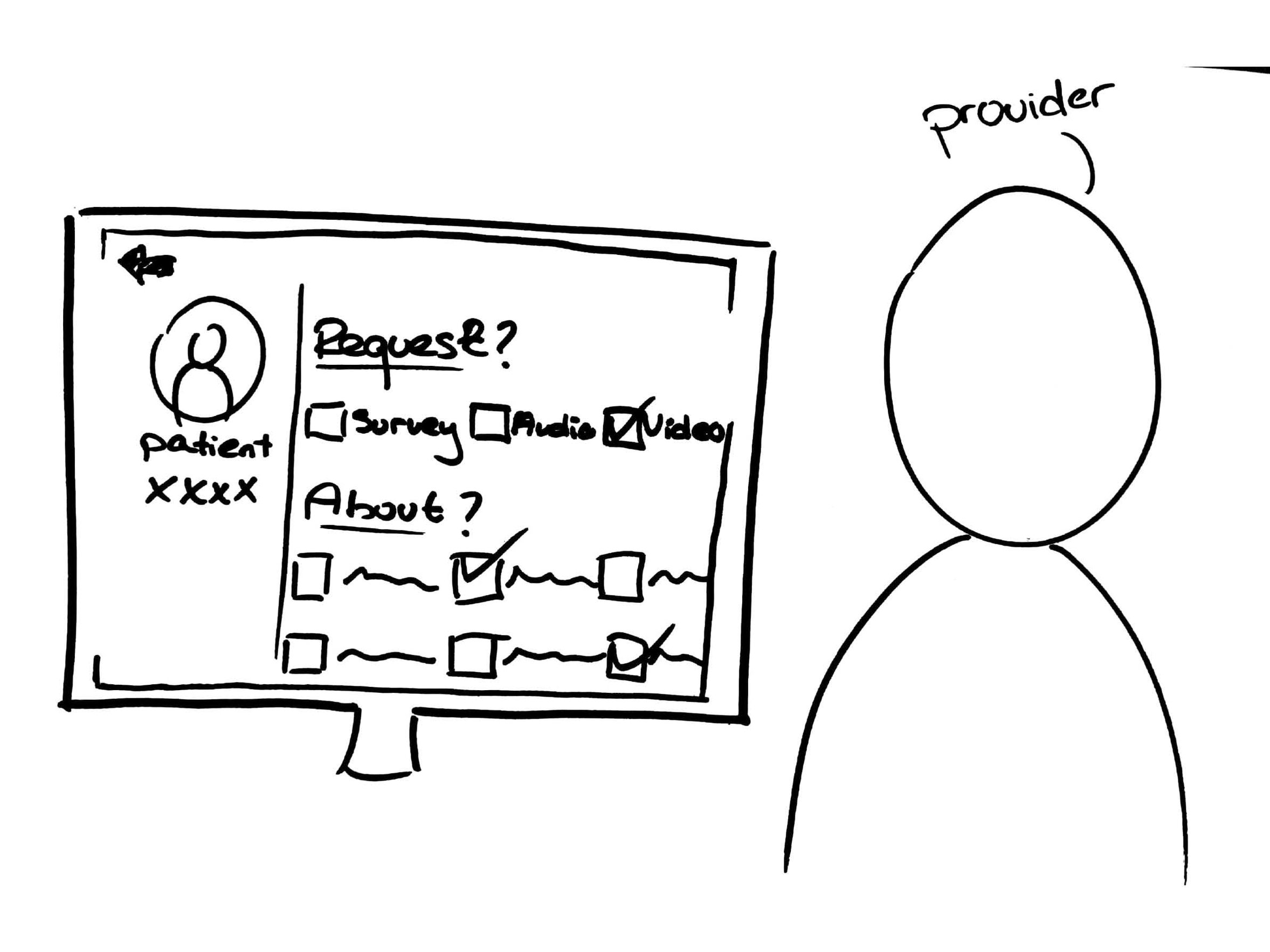
Once the design direction was clear, the team moved on to the next phase: ideation. With each idea, the team aimed to address the tension of not properly matching patients with providers, and not being able to assist them prior to the initial session. After various sessions of brainstorming, team envisioned the solution to be a mobile application for the patients and a software for the providers. The provider side was the secondary priority, yet it was still a key point to create a full interactive experience. Once the concept is finalized, it was time to prototype them. It was all on half sheets initially, as can be seen above, where the first group shows the patient app while the second batch showcases the provider's software. These early stage prototypes soon lead to a full fledged solution: Curo.






Solution: Curo
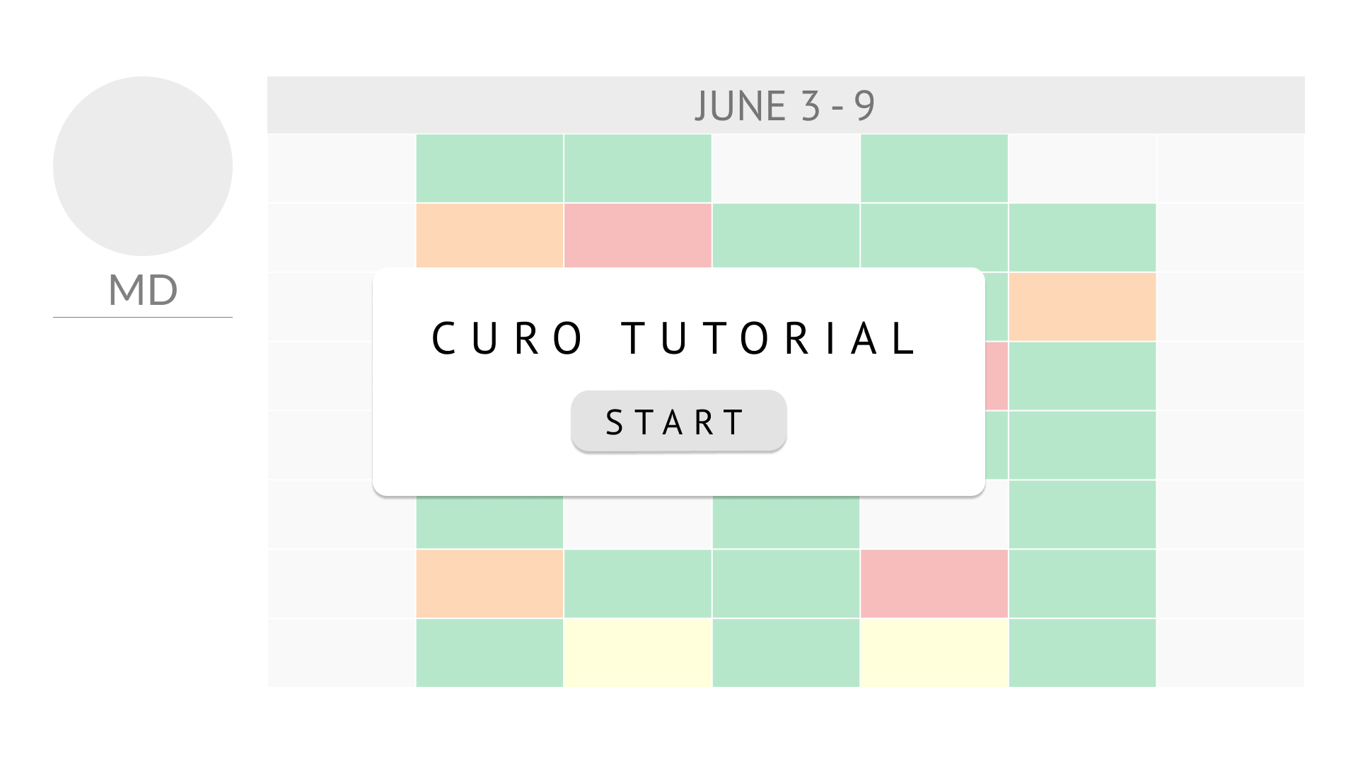
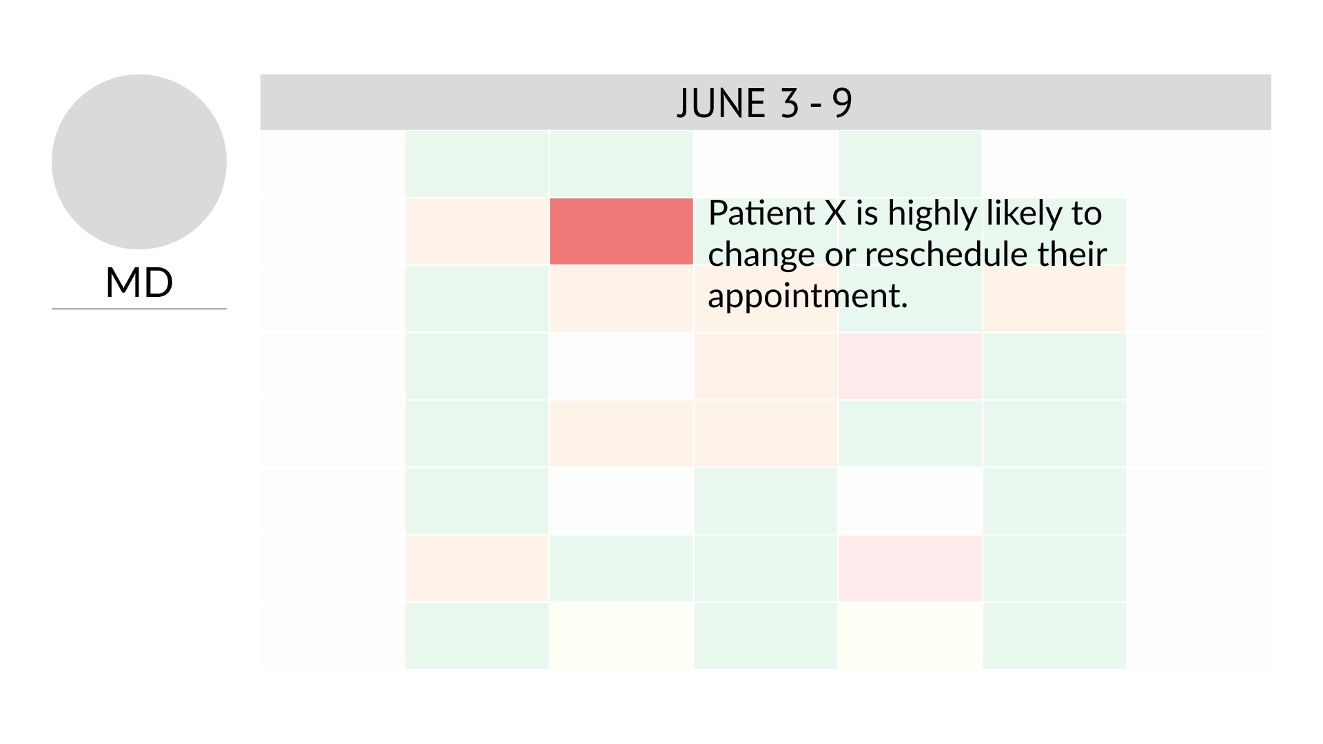
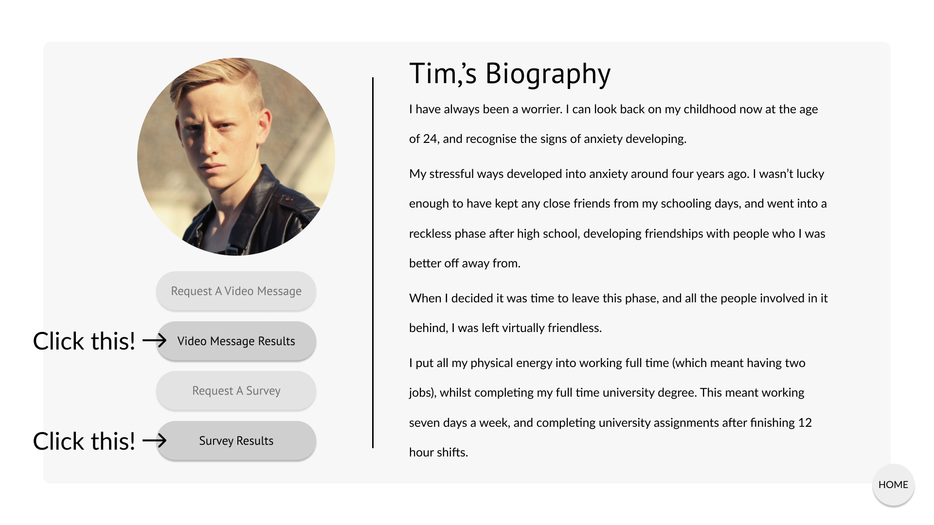
Curo is designed to address the major needs of both stakeholders. By creating a mobile application that focuses on decreasing the unknowns, educates the patients on the existing treatments and matches them with the proper provider, when they are ready to take the next step. Once the patient books an appointment, they will receive recurring questions that are tailored to their conditions to be shared with the provider. Provider on the other hand can benefit from their computer software by receiving these information about their patients prior to the session. Curo is programmed to understand how the patient is doing, and if their conditions worsen, is designed to reschedule them to an earlier time frame. If a patient cancels their appointment, not only it aims to reschedule them to a more comfortable time, but also fills that gap by asking other patients if they want to come earlier, and makes changes in the calendar to make sure that there is no last minute gaps. The concept of Curo is designed for patients and for providers, to create a better experience in their collective journey.

